Blue Cross Blue Shield of IL, TX, OK, NM, & MT
Health care service corporation
BCBS.com Redesign
brief.
There’s nothing like curling up next to the fire and reading the age old story of a mega insurance conglomerate working to update their five public-facing websites after years of somewhat iterative and disjointed updates all while attempting to roll in dozens of partner and subsidiary websites under the same information architecture—all while trying to implement a fledgling design system across multiple platforms.
What? That’s not your favorite bedtime story?
TYPE OF WORK
UX Design, UI Design
TITLE
Lead UX / UI Designer, Producer
TOOLS USED
Figma, Sketch, Axure, Google Sheets, Google Slides
Context.
HCSC, a.k.a. Health Care Service Corporations, a.a.k.a. Blue Cross and Blue Shield of Illinois, Texas, Oklahoma, New Mexico and Montana, had quite the conundrum:
Over the years, numerous acquisitions and modifications to business structures had caused their public websites (like bcbsil.com and bcbstx.com) to become littered with untidy code, circuitous navigation pathways, and a general lack of cohesion.
A few years ago, the company did refresh their websites’ look and feel from strictly 2007, to something approaching a modern look and feel. The problem was, multiple development teams, design teams, and differing state regulations led to a confusing navigation and several user interface and user experience design inconsistencies.
This made it difficult to foster the trust and confidence their members and site users needed, and let to many, many hours on the phone with customer service.
gaining consensus.
The first step in any large organization is to get consensus among the various stakeholders and organizational leads. The work here was only second to the next step… actually getting the project funded.
My approach was to lead several discovery sessions with the DotCom team leads and business unit leads to define a solid set of business goals for the public websites. We needed to look at what functions the sites would perform in service or the various markets, customer groupings, and product lines. Without a business goal driving the site, it would never get sign off from the business leads, let alone the higher ups.
Our fresh angle was to start by presenting the idea that, rather than just be a confusing glossary of insurance terms, we would actually make a marketing-focused tool set to be used in various context for each business unit.
Looking to increase Affordable Care Act marketplace membership? We’ve got a plan for that. Need your Mid-Market sales leads to have a ready-made sales microsite ready to go for new customer pitching? We’ve got a plan for that too. How about a unified approach to transversing the hairball of benefits options so we can reduce call center volume? We’ve got you.
Selling for buy-in.
Putting the “fun” in funding.
Enjoying our hard won consensus with the business teams, I started work on the next hurdle: convincing leadership we deserved and needed funding for this mammoth project.
In this case, I wasn’t just arguing for a job number for the project. I also needed to convince IT / engineering that we needed resources, which needed funding… and most of all, we needed to secure funding for the design system team to be able to handle the additional workload of bringing a very much alpha stage system to production-ready within 6-8 months (more on that later).
Managing upwards
I, being a contractor working as a direct report to the DotCom team lead, didn’t possess the political capital within the company to take part in pitching leadership directly. I made it my responsibility to create the pitch strategy and arm my team with the information needed to make a clear business case for completely redesign and aggregating all public-facing web properties into a unified marketing machine.
To sell this in, we needed to show how this project would positively affect the bottom line. Being self employed, and the son of a manufacturing company owner, I knew that there were two major ways to increase the bottom line:
Increase the top line
Decrease operating expense
First, the easy one—reducing operating expense. I worked with the various business teams to understand how much effort was going into maintaining the current state, and how much effort was needed to create new web properties (re: open enrollment updates, new partner websites, new initiatives). Long story short, there was a TON of manual labor going into both of these types of efforts, much of which could be simplified by having a unified, scalable, componentized code base and a solid UX/IA methodology in place.
Next, increasing the top line. This took a little bit of a leap of faith, but by showing how we could use the public-facing sites as an actual sales and marketing tool, with the goal of being able to transact online in some cases, we would be able to pay for some of the initial funding with actual revenue from the thing we were building!
Information architecture overload.
Down to brass tacks.
The first step in our journey of actually doing a thing was to take a real inventory of all existing content, how it is currently connected, and what its intended usage is. Unfortunately, the current state system was split between various content management systems and hosting providers, so there wasn’t a simple programmatic approach to building our inventory. This meant painstakingly running though all the site content for the most part, manually.
Once we had this information, we would be able to rebuild the information architecture into a unified system with carefully designed conversion funnels.
Project plan cat herding.
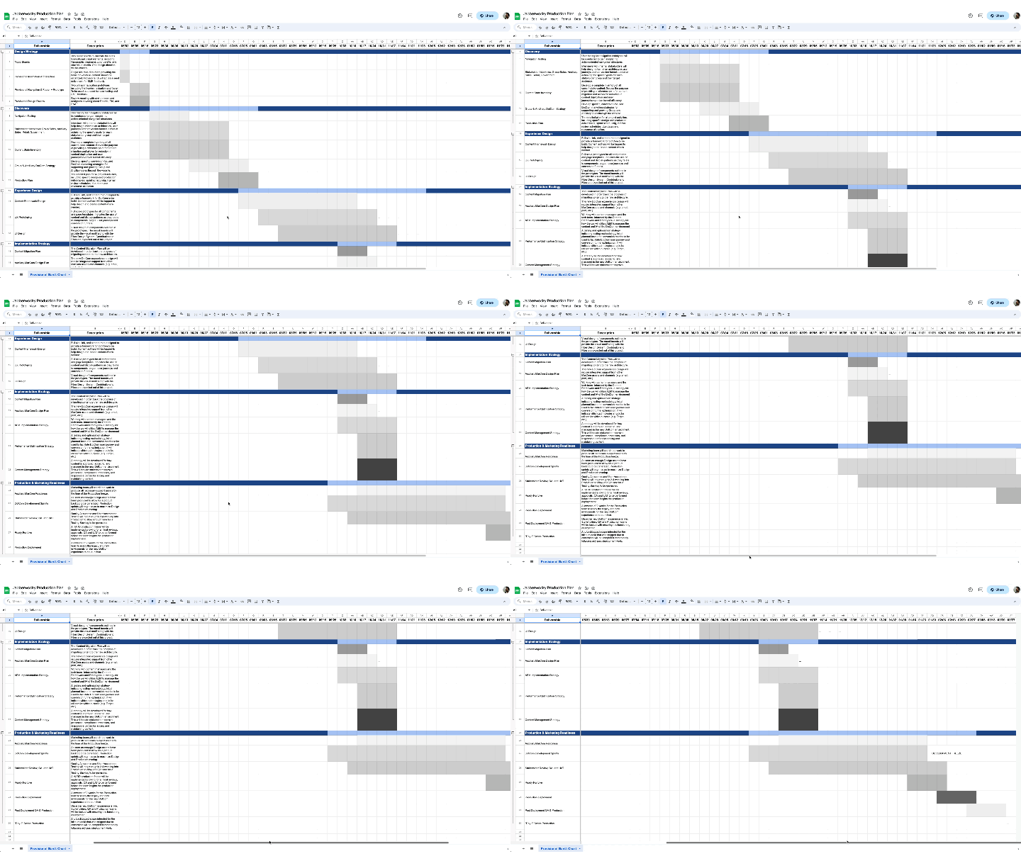
This was intended to be a 6-8 month project. My goal was to get from design direction sign-off in May to a production version of the sites ready by December. I worked with IT / Engineering, the design team, and the DotCom team to finalize a production plan that detailed each of the major project phases, milestones, dependencies, review structure, and responsible parties.
There were spreadsheets… there were presentations… there were raised eyebrows… and then there were some high-fives, virtually of course.
Design direction.
It’s as easy as 1, 2, done.
To get aligned on the look and feel of the new sites, I decided to start by circulating a pair of mood boards to key stakeholders in order to get feedback. We didn’t want to belabor the initial steps too much because this sort of thing can get stymied quickly with too many cooks in the kitchen.
So I settled on, “Which do you like better? A or B? Why?”
Once we had a few niggles sorted out, I was off to work with the design system team.
Fresh-ing the design systematically.
Now for the star of the show!
Fiber, the HCSC design system. My goal was to utilize as much of the existing design system as possible, giving elements a UI refresh and increasing the overall number of usable components.
After landing on a design direction based on the mood board exercise, we looked at what we needed to do to get the design system updated.
Leveraging the design system to move the needle.
This is the key to the entire plan. IT / Engineering don’t want to do a ton of new code-writing, content creators and editors don’t want to spend a bunch of time designing new content, and the design team didn’t want to spend a bunch of time dreaming up new ways to reinvent the wheel.
So long as we could get Fiber into operating shape, it would be remove most of the labor down the road in this project. For example:
- IT would never need to code a new card component because it’s already defined in the system
- Content creators would have a stable of existing plug-and-play components to work with to tell their story
- The design team could leverage existing components in interesting ways and only be challenged by novel contexts requiring a contribution to Fiber
Once the initial hurdle of converting existing properties to leverage Fiber, much of the “building” would be done by a single team rather than a delicate and tedious ballet between the three.
Wireframes, prototypes and comps, oh my!
Once we had alignment with the Fiber team, we worked to tackle one of the biggest challenges: navigation, both in the main navigation and inline.
We produced several iterations of wireframes and prototypes to solve for the best possible user experience out of the gate.
We settled on A/B testing two primary navigation styles and two primary inline navigation methodologies.
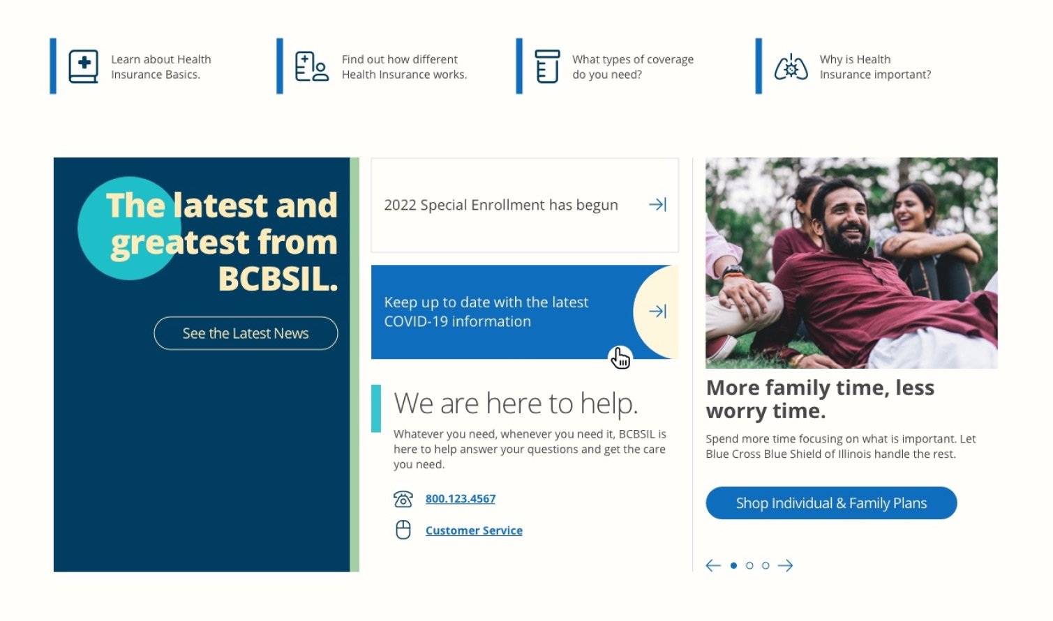
To bring concepts these to life, we created some high-fidelity comps using the Fiber design system as implemented in Sketch.
To bring concepts these to life, we created some high-fidelity comps using the Fiber design system as implemented in Sketch.
Disaster!
An unexpected re-org.
Well, not everything works out like you want or expect. About halfway through this wonderful display of coordination and teamwork, leadership decided to announce it would be reorganizing all of the teams in-play. Unfortunately, this blew a big hole in our efforts—funding dissolved, teams were shuffled, and we did not get to see the plan come to fruition.
Some advances were made, especially in cleaning up some of the existing navigation, cleaning up some conversion pathways, but the ultimate goal of having a well-oiled, system driven approach to design just wasn’t in the cards during the lifetime of my contract with the company.


