beam suntory
The Blend Bartenders Hospitality Resource
empowering a worldwide community of bartenders
brief.
Beam Suntory, the makers of premium spirits such as Jim Beam, Makers Mark, Courvoisier, and others, was looking for a way to connect to one of its most influential communities: Bartenders. The goal was to create a place to highlight community members, the cocktails they create, inspiration, and a place to learn and share their experiences.
I was brought in to research and create the user experience design and rationale, the design system, and the user interface design.
TYPE OF WORK
UX Design, UI Design, Front-End Development
TITLE
Lead UX / UI Designer
TOOLS USED
Axure, Sketch, Panic Coda, Codekit
The challenge.
Beam Suntory wasn’t starting small. With a global presence and a full host of products, we needed to create an entire ecosystem out of the gate. The plan was to build the web app in Drupal CMS, meaning content and component design were extremely important, as we didn’t want content creators and editors to be overwhelmed with design decisions.
Out of the gate, we needed to solve quite a few navigation design challenges.
The first task was to break the project down into discrete steps:
Define the site information architecture and lexicon
Create a strong design language
Analyze content types and generate view states and content types
Create a scalable, responsive, componentized design system
Develop the front-end Drupal Theme and deliver it to Beam Suntory engineers
The outcome.
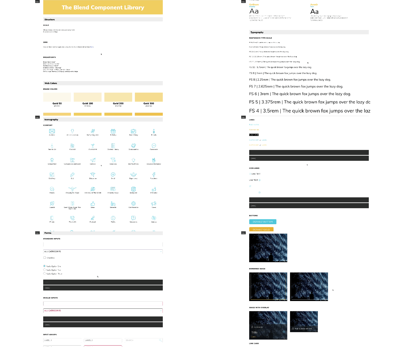
One of the keys to making this work well after handing off to Beam Suntory was the development of a design system with appropriate documentation for them to be able to build and iterate as the scope changed over time. To accomplish this, we provided a live style guide replete with inline code examples and documentation.
The live style guide
The style guide follows the Atomic Design methodology, starting with Atoms (or simples), such as colors, icons, typefaces, font sizes and font weights. We then use these simple components to build increasingly larger and more complex components, such as buttons, typographic groupings, cards, and navigation patterns.
Following this approach allows for an easy handoff to engineering and serves as living documentation for future component development.
Scroll and click anywhere on the Figma prototype above to take a quick tour of The Blend view state comps.
The view comps
To illustrate how the existing components are intended to be used, we also worked through our information architecture to define several view states. This would encompass things like:
The Home page
News / Events / Products Listing Pages
Product Detail Pages
User Account Pages
And so on.
The result.
TheBlend.world has been around and is a successfull online community and resource hub for bartenders.It is now in its second design iteration, but many of the original tenents are still in place today. I am proud to say I helped bring this platform into existence and that it is still going strong today.


