dearborn group
Creating a better benefits management experience.
New Member Benefits Portal
brief.
I worked with Dearborn Group, a subsidiary of Health Care Services Corporation (otherwise known as Blue Cross Blue Shield for Illinois, Texas, Oklahoma, New Mexico and Montana) to build a brand new member benefits portal.
Their specialty is providing additional insurance to people for things like short and long term disability, vision, and critical illnesses.
TYPE OF WORK
UX Design, UI Design, Design System Creation
TITLE
Lead UX / UI Designer
TOOLS USED
Axure, Figma, Panic Nova
why.
First, a note on the insurance industry—
Large insurers don't start large. Like any other business they grow, and often acquire other businesses to expand their product offering. However, insurance agencies are often slow to integrate, and often slow to put priorities on their customers. Their user experience is usually based on their business model, which as we know, is extraordinarily confusing for us simple humans.
Dearborn wanted to change that. So they hired me to help consolidate their member portal into a single, unified experience.
Business centered.
Prior to implementing the new portal, Dearborn's online member servicing applications were narrow-focus, antiquated, and disjointed. We can just say, the telephone was quite warm.
Additionally, the development team and IT teams charged with managing their systems had not worked with a product designer before, so there was a nice learning curve to work through.
Research and requirements.
For this project, requirements gathering and consensus building amongst stakeholders and IT was paramount. Numerous back-end systems were being updated to mingle PII (Personally Identifiable Information) and it's pretty important that disability claims information is gathered and displayed correctly.
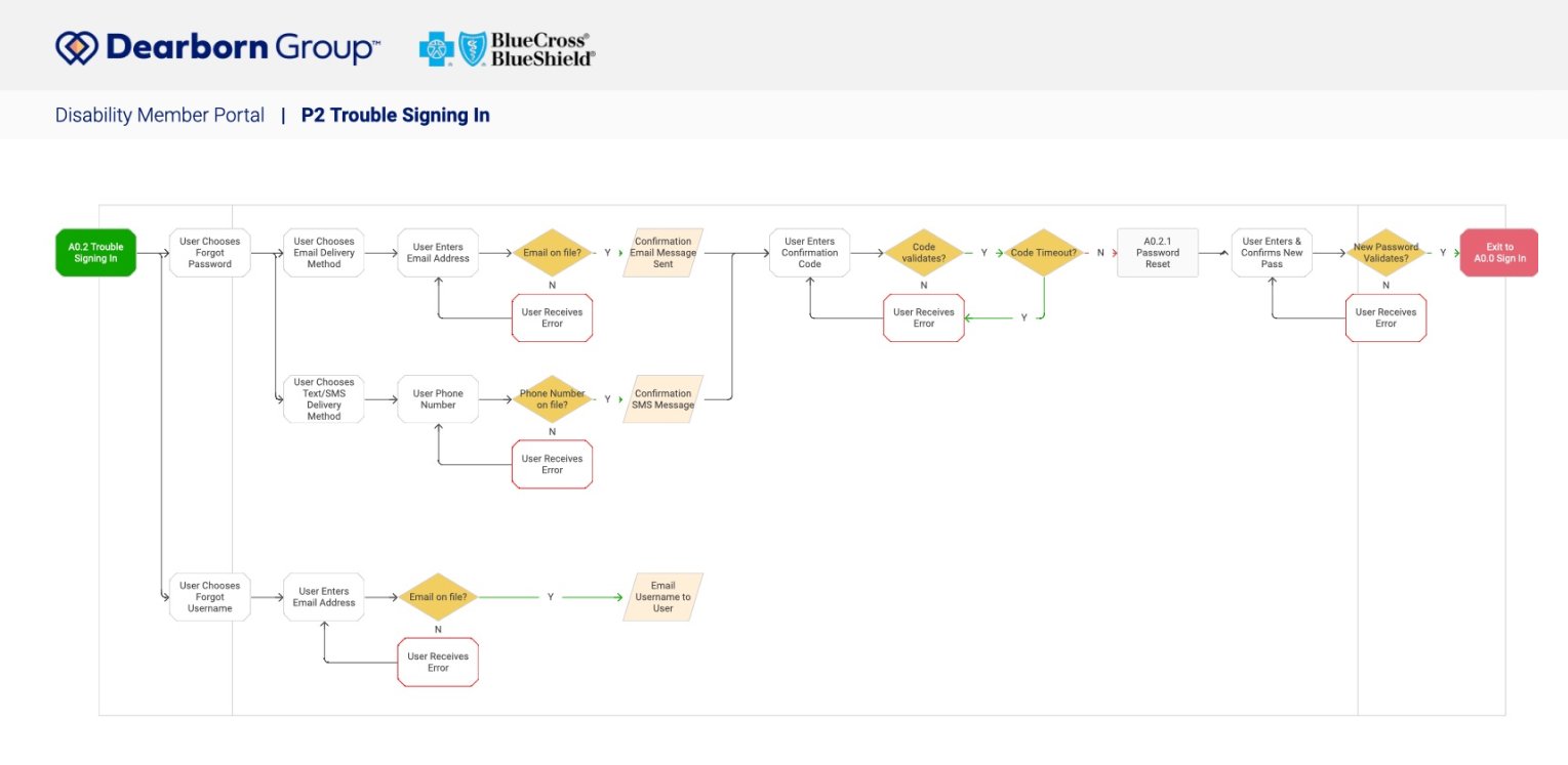
Building detailed sitemaps, system and user flows was a great first step in getting everyone aligned on the input / output of the app. It also allowed us to catch any gaps in thinking and start with a very solid foundation.
Guided workflows FTW.
Having worked with quite a lot of insurance agencies in the past, I was able to draw on a wealth of user studies for this process—and one thing is for certain, no one understands how insurance works. Not on this side of the fence anyway.
Contextual information bucketing and designing engaging workflows is key to user trust and success for everyone involved.
The solution.
We landed on a few key design thinking tenets that would guide the project through the multi-stage design process—
Construct Mental Models
Insurance benefits management has a few key concepts, like a claim and a beneficiary. We needed to break down siloes between business units and rewire thinking so we could explain how it works to people
Build Iteratively
Our initial few design sprints were focused solely on creating the experience for managing the account setup and welcome guide. We wanted to start small and test what would be the most important feature for those entering the new portal for the first time… which in this case would be everybody!
From there, we added layers of scope and functionality like, secure messaging and benefits management, and performing user testing along the way to ensure we weren’t engineering ourselves a three-headed monster.
Micro-interactions for Navigability
You won't ever get away from a large form in insurance, but we can build the interaction layer to guide people through complicated data input intuitively by keeping clutter to a minimum.
Prototypes, flows, a design system, and a live style guide.
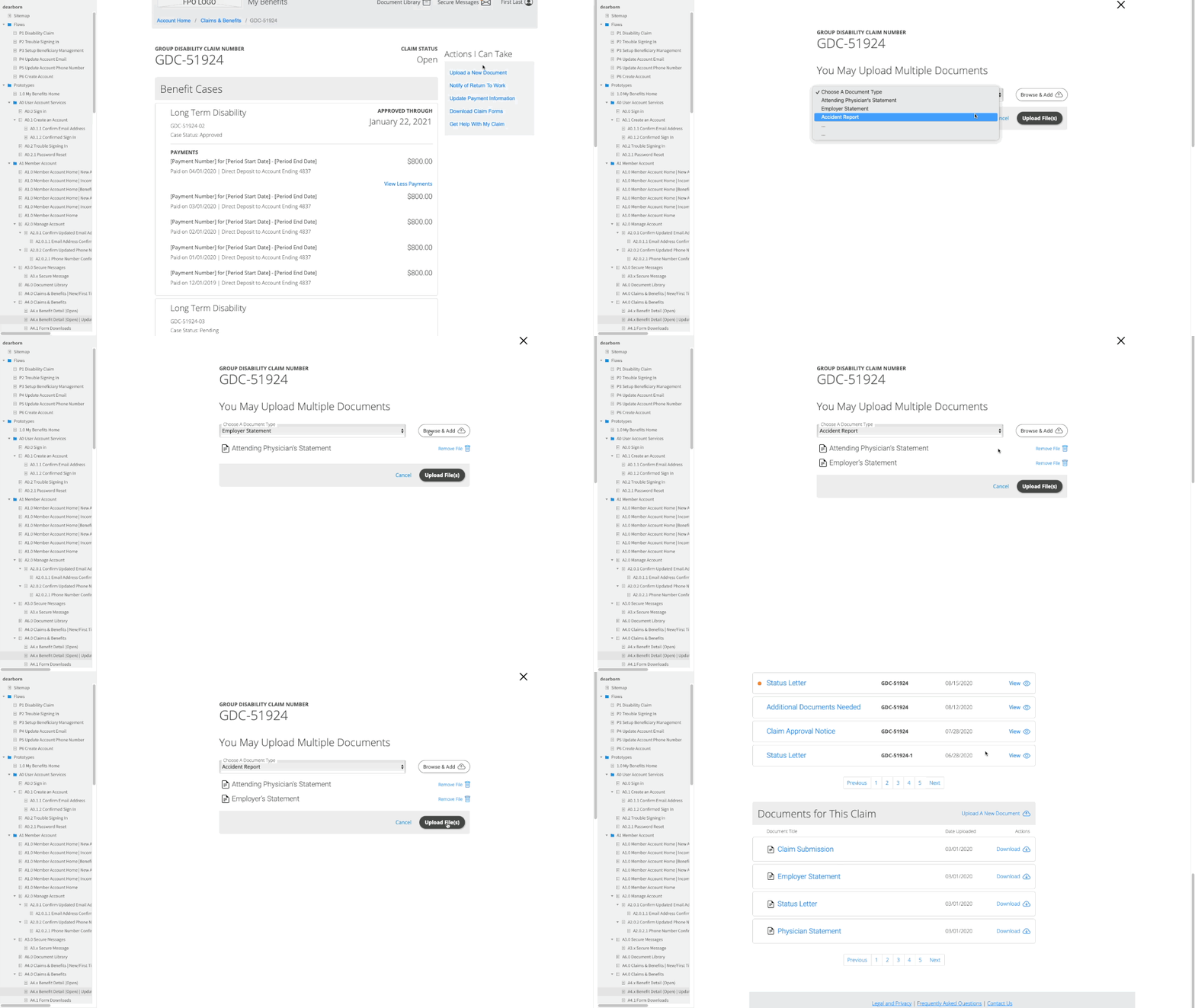
During this 6 month project, I created a fully interactive, medium fidelity prototype with accompanying site map and flow diagrams to guide the development team.
In order to create prototypes rapidly and aid in the speed of development for sprints, I also created a design system with over 100 artifacts incorporated into a live style guide. Utilizing this method allowed me to quickly create new prototypes that were directly tied to the design system. It also significantly reduced front end development time by removing loads of ambiguity.


