onlyinmadrid.com
only in madrid
the north american destination tourism website for madrid, spain
brief.
The city of Madrid’s destination marketing organization (DMO) is looking to entice North American travelers to visit Madrid and the surrounding regions.
My role was to lead the creative direction for the digital presence and design a logo mark for the campaign.
TYPE OF WORK
UX Design, UI Design
TITLE
Lead UX / UI Designer
TOOLS USED
Figma, Wordpress
Creative Direction
It’s not often you get close to free reign with creative direction, especially with a well-established client. We had received only a few basic colors and three words from the client:
Bold. Zesty. Spicy.
The rest was up to me to find a creative theme that would embody the ancient city and appeal to American tourists.
tone guide
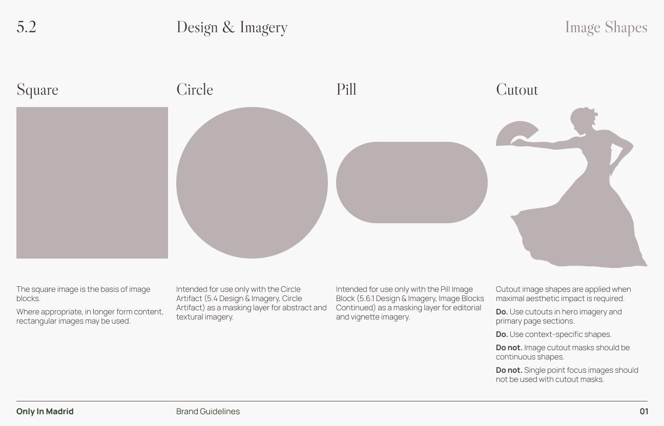
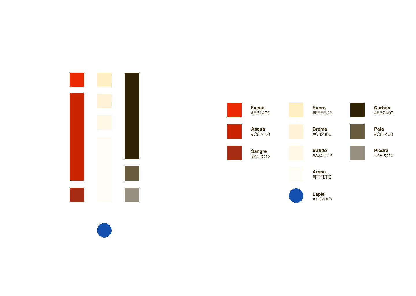
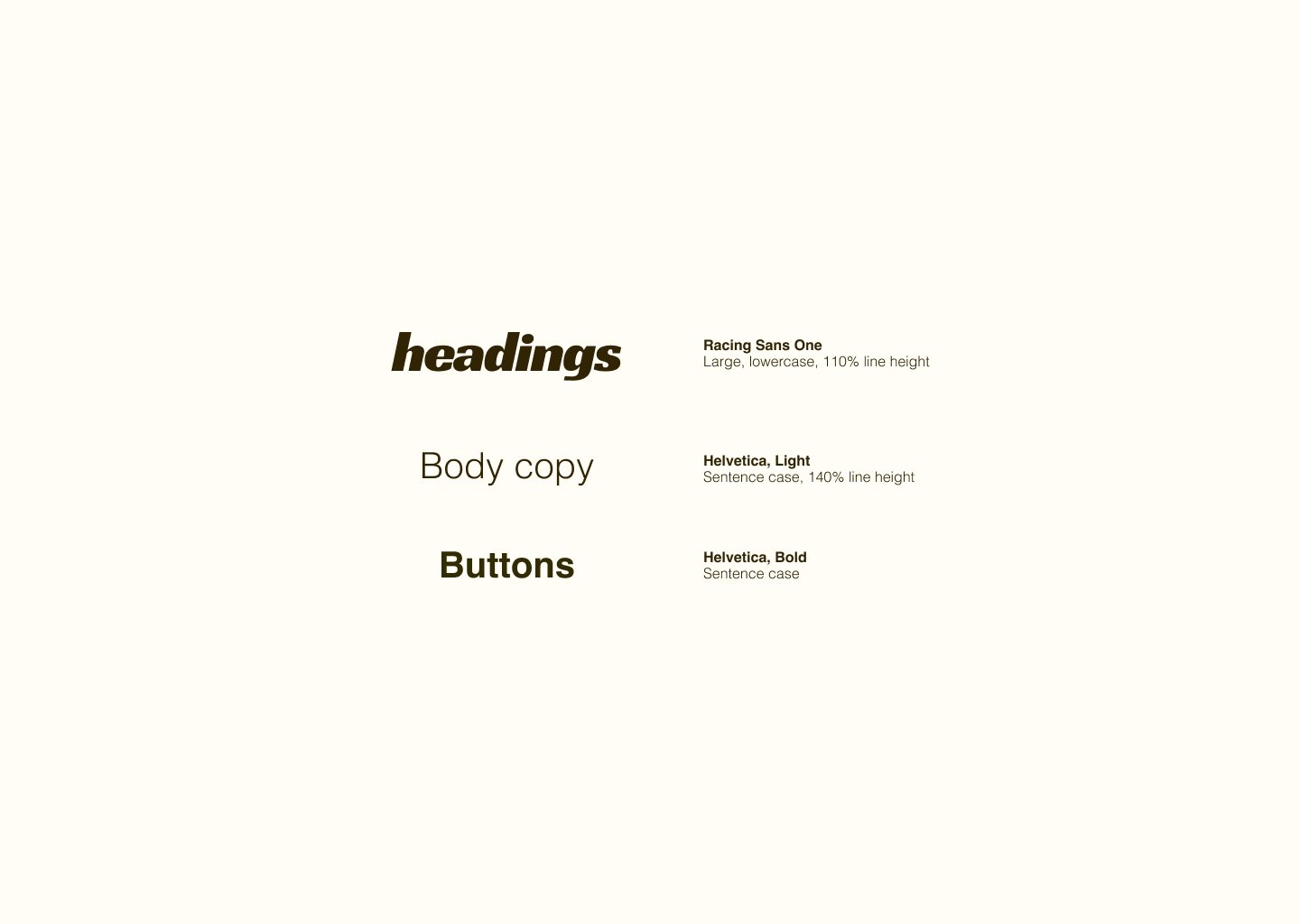
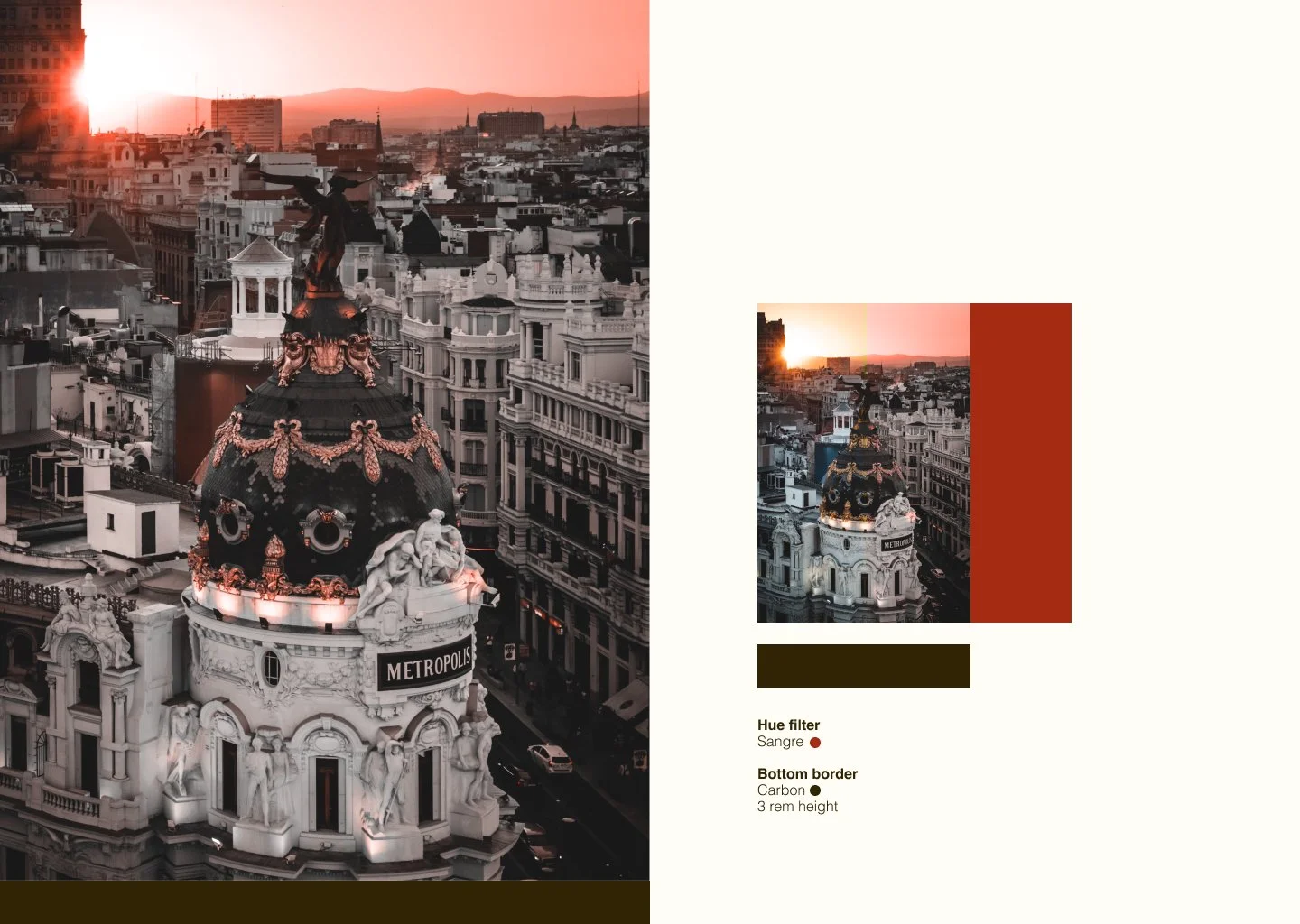
Before dropping into high-fidelity design work, I wanted to set the color space, typographic language, and image processing in place… sort of like a creative mission statement that I could refer back to while making design decisions for this first phase.
The tone guide wasn’t meant to be a client-facing deliverable, just something to work from and share with the rest of the team while thinking through where to start with the Mood Boards.

mood boards
Because I had so little direction directly from the client at this stage, I knew we would almost definitely be in for some massive course correction after sharing our initial direction options with them.
I started with a set of two mood boards with drastically different aesthetics—both intended to be highly immersive. The intent here was more to sus out what the client liked and didn’t like without getting too deep in the weeds on a particular aesthetic.
70’s Spy Thriller | The first played on the bustling, big city feel. Using high-contrast photography and impactful typography while mixing in fun vector elements to tone down the 70’s spy movie feel a bit.
The Architectural Tour | The second focused on white space and architectural-inspired elements to highlight the juxtaposition of the modern and ancient culture of the city.
more mood boards!
The first round of mood boards taught us a great deal about what the Madrid DMO was looking for. Time for three new boards.
Spicy Cologne | The Spicy Cologne concept plays with light and dark, intricate textural elements, and purposeful photography. Highly contrasting colors set the mood while also providing satisfying visual pallet cleansers.
The $400 T-Shirt | Clean and “designy”, the $400 T-Shirt concept wears it’s visuals front and center with no added fanfare. Custom abstracted illustrations and time-tested typography move your eye through the content using sparse copy and brilliant imagery.
Spanish Minimalist | Spanish design is far from the minimalist aesthetic. The Spanish Minimalist concept plays back the “website” and promotes immersion through full-screen visuals and textural backgrounds. Unique typography allows for maximal messaging with minimal copy.
logo mark design
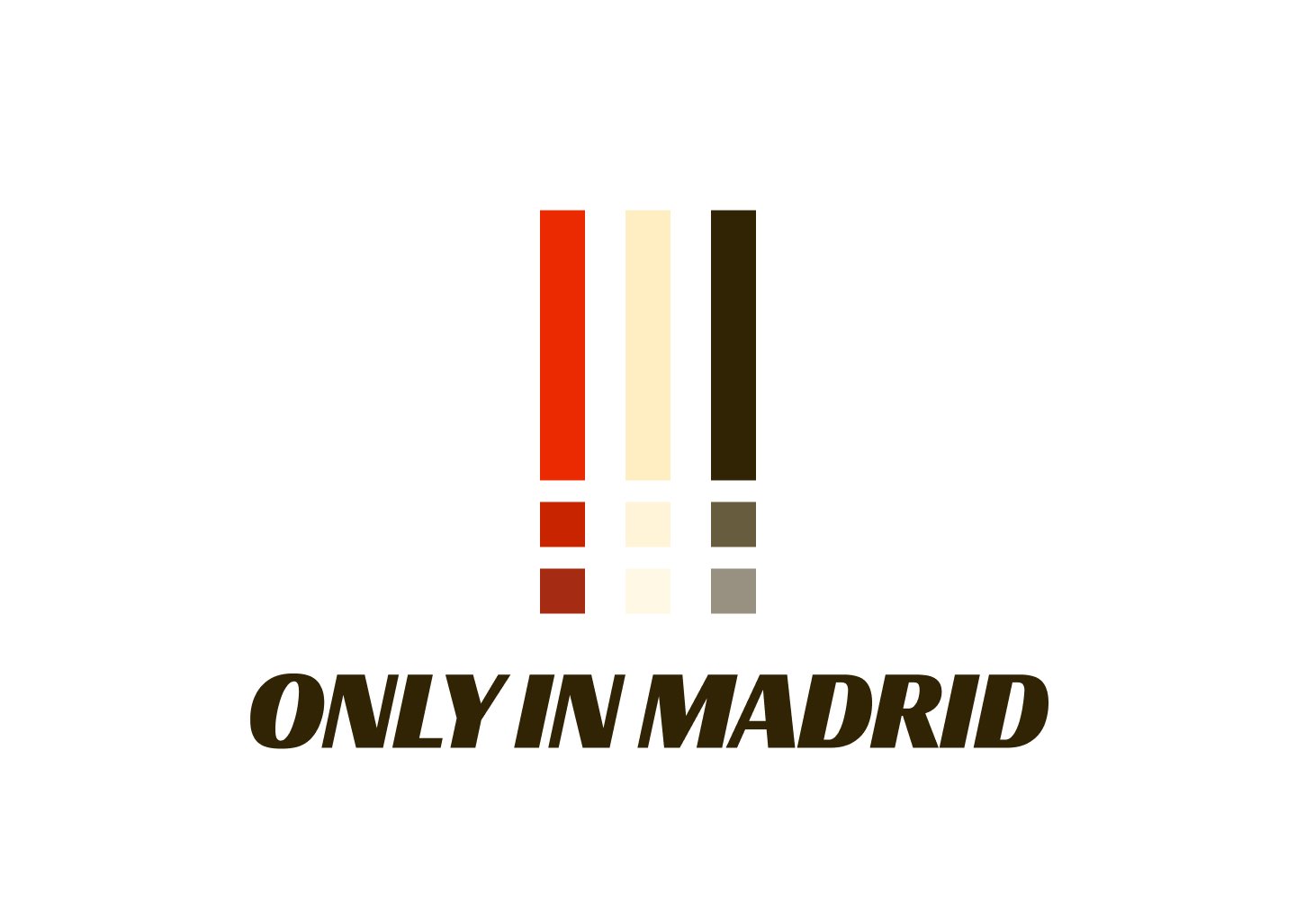
Madrid also wanted a custom logo mark for the North American site. As we weren’t sure exactly how the logo would be used beyond the website, I took several approaches. Some were aimed more toward high readability and recognisability, and others a bit more artful.
finalizing creative direction
After a few rounds of review on the mood boards, we were able to finalize a direction by, you guessed it, combining elements from each of the boards into one megaboard!
Creating the Style Guide
In an effort to make development handoff seamless as well as inform any other designers who might enter the project later, I created a comprehensive style guide. Additionally, I ensured the Figma file was setup with intuitive components, variables, and image-processing tools.


